

metadata
order: 2
title: 节点菜单配置
mobile: false
group:
  title: 基础用法
  order: 1
节点菜单配置
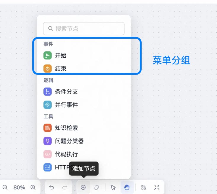
节点菜单由右下角工具栏点出,展示画布面板的所有节点,可直接点击节点菜单面板中的节点,将节点添加进画布中。节点菜单支持分组展示,可以为不同类型的节点创建不同的分组,使界面更加清晰。
配置说明
1. 分组配置
节点菜单支持分组展示,每个分组包含以下配置:
interface GroupConfig {
  title: string;      // 分组名称
  type: '_group';     // 分组类型,固定为 '_group'
  items: NodeConfig[]; // 分组下的节点配置列表
}
2. 节点配置
每个节点可以配置以下属性:
interface NodeConfig {
  title: string;           // 节点名称
  type: string;           // 节点类型
  description?: string;   // 节点描述
  icon?: {               // 节点图标配置
    type: string;        // 图标类型
    bgColor: string;     // 图标背景色
  };
  hideDesc?: boolean;    // 是否隐藏节点描述
  nodePanel?: {         // 自定义节点的面板配置
    width?: number;     // 面板宽度
  };
  settingSchema?: {     // 节点的业务配置信息
    type: string;
    className?: string;
    properties: Record<string, any>;
  };
}
3. 节点图标配置
节点的图标配置目前支持两种形式:
- iconfont 的图标
- 自定义图标组件展示。通过这种方式可支持图标的 SVG 形式、图片形式、其他自定义样式。
3.1 iconfont 图标的用法
- 首先在 iconfont 官网中选择图标后添加到项目中,在项目中找到图标,复制图标的代码,以及生成图标库的 Symbol 链接。
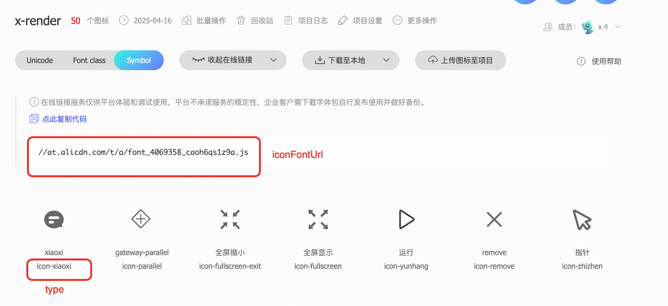
- 在 iconFontUrl 属性中引入图标库的 Symbol 链接:
<XFlow
  settings={nodeSettings}
  initialValues={initialValues}
  iconFontUrl="//at.alicdn.com/t/a/font_4069358_caoh6qs1z9a.js"
/>
- 然后在节点配置中配置 icon 属性,type 为 复制的图标的代码,bgColor 为图标的背景色:
{
  title: '结束',
  type: 'End',
  description: '流程结束节点,用于标记流程的终点',
  icon: {
    type: 'icon-xiaoxi',   // 图标类型
    bgColor: '#F79009',    // 图标背景色
  },
  settingSchema: {
    type: 'object',
    properties: {
      output: {
        title: '输出结果',
        type: 'string',
        widget: 'textarea',
      },
    },
  },
}
3.2 自定义图标组件
比如实现图标的 SVG 形式。首先创建SVG组件如下:
const CustomSvg = ({ setting }) => {
console.log('接收参数node setting', setting);
return (
  <svg viewBox="0 0 1024 1024" width="1em" height="1em" fill="currentColor">
    <title>Panda icon</title>
    <path
    d="M99.096 315.634s-82.58-64.032-82.58-132.13c0-66.064 33.032-165.162 148.646-148.646 83.37 11.91 99.096 165.162 99.096 165.162l-165.162 115.614zM924.906 315.634s82.58-64.032 82.58-132.13c0-66.064-33.032-165.162-148.646-148.646-83.37 11.91-99.096 165.162-99.096 165.162l165.162 115.614z"
    fill="#6B676E"
  />
  <path
    d="M1024 561.548c0 264.526-229.23 429.42-512.002 429.42S0 826.076 0 561.548 283.96 66.064 512.002 66.064 1024 297.022 1024 561.548z"
    fill="#FFEBD2"
  />
  <path
    d="M330.324 842.126c0 82.096 81.34 148.646 181.678 148.646s181.678-66.55 181.678-148.646H330.324z"
    fill="#E9D7C3"
  />
  <path
    d="M644.13 611.098C594.582 528.516 561.55 512 512.002 512c-49.548 0-82.58 16.516-132.13 99.096-42.488 70.814-78.73 211.264-49.548 247.742 66.064 82.58 165.162 33.032 181.678 33.032 16.516 0 115.614 49.548 181.678-33.032 29.18-36.476-7.064-176.93-49.55-247.74z"
    fill="#FFFFFF"
  />
  <path
    d="M611.098 495.484c0-45.608 36.974-82.58 82.58-82.58 49.548 0 198.194 99.098 198.194 165.162s-79.934 144.904-148.646 99.096c-49.548-33.032-132.128-148.646-132.128-181.678zM412.904 495.484c0-45.608-36.974-82.58-82.58-82.58-49.548 0-198.194 99.098-198.194 165.162s79.934 144.904 148.646 99.096c49.548-33.032 132.128-148.646 132.128-181.678z"
    fill="#6B676E"
  />
  <path
    d="M512.002 726.622c-30.06 0-115.614 5.668-115.614 33.032 0 49.638 105.484 85.24 115.614 82.58 10.128 2.66 115.614-32.944 115.614-82.58-0.002-27.366-85.556-33.032-115.614-33.032z"
    fill="#464655"
  />
  <path
    d="M330.324 495.484m-33.032 0a33.032 33.032 0 1 0 66.064 0 33.032 33.032 0 1 0-66.064 0Z"
    fill="#464655"
  />
  <path
    d="M693.678 495.484m-33.032 0a33.032 33.032 0 1 0 66.064 0 33.032 33.032 0 1 0-66.064 0Z"
    fill="#464655"
  />
</svg>
)};

export default CustomSvg;
然后在全局widgets中引入SVG组件
<XFlow
      settings={settings}
      initialValues={initialValues}
      widgets={{CustomSvg}} // 引入SVG组件
 />
最后在节点配置settings中配置iconSvg属性
 {
  title: '流程控制',
  type: '_group',
  items: [
    {
      title: '开始',
      type: 'Start',
      description: '流程开始节点,用于标记流程的起点',
      icon: {
        bgColor: '#17B26A', // icon背景颜色
      },
      iconSvg: 'CustomSvg',  // 设置SVG组件
    },
  ],
},
完整示例
注意事项
- 节点类型(type)必须唯一,用于标识不同类型的节点
- 图标配置支持自定义图标类型和背景色,或者使用图标的SVG格式
- 节点配置面板(settingSchema)需要符合 FormRender 的协议规范
- 可以通过 hideDesc 属性控制节点描述的显示/隐藏