
Guided Tours API
Guided Tours are declared in JSX as a tree of elements. All of them are available as named exports from client/layout/guided-tours/config-elements.
Tour
Tour is a React component that declares the top-level of a tour. It consists of a series of Step elements and defines when a tour should start by setting appropriate props.
There are three ways a tour can get triggered:
- If the user navigates to a path that matches the tour's
pathproperty and the tour'swhenproperty evaluates to true and there is no other tour that is either running or could also be triggered (in the case of multiple tours that could be triggered we just choose the first match). Every tour will be triggered only once for a user when using this mechanism. - If the user navigates to a URL that contains the tour's name in the
tourquery argument -- e.g.,?tour=main. This will ignore thepathandwhenprops as well as the user's tour history. - We can dispatch the Redux action
requestGuidedTour( tour )to trigger a tour as well. This will ignore thepathandwhenprops as well as the user's tour history.
Props
name: (string) Unique name of tour in camelCase.version(string): Version identifier. We use date string like "20161224".path(string or array, optional): Use this prop to limit tour only to some path prefix (or more prefixes if array). Example:path={ [ '/stats', '/settings' ] }when(function, optional): This is a Redux selector function. Use this to define conditions for the tour to start. Can be overridden by adding atourquery argument to the URL like so:?tour=tourName, in which case the tour will be triggered even ifwhenwould evaluate tofalse. This is useful for sending along a tour via email or chat. On the other hand, the framework will try to not trigger a tour multiple times (seetoursSeenin ARCHITECTURE.md). Note: you can reset the tours history by adding?tour=resetto the URL.children(nodes): only supported type is<Step>
Example
// tour with a single step
<Tour path="/me" name="exampleTour" when={ isNewUser }>
    <Step>…</Step>
</Tour>;
Note that you can use e.g. the and utility function to connect different when conditions. When you do so, consider your conditions' order: the function stops evaluating its argument functions as soon as one condition is false. This will affect you if you're assigning users to an A/B test, for example. Also think about how computing-intensive the functions are -- ideally order them so that you can bail with the least amount of resources as possible.
For more comprehensive examples of tours, look at TUTORIAL.md or explore existing tours in client/layout/guided-tours/tours.
Step
Step is a React component that defines a single Step of a tour. It is represented as dark box on top of Calypso UI. Step can be positioned in many ways in relation to any DOM node in Calypso.
Props
name: (string) Unique identifier of the step, used for addressing a step fromNextorContinue. Useinitto indicate the step that the tour should start with.target: (string, optional) Target which this step belongs to and which will be used for positioning. See Targeting elements in Calypso for more info about the format.placement: (string, optional) Placement. Possible values:below,above,beside,center,middle,right,left.arrow: (string, optional) If defined, the step will be rendered with an arrow on its border pointing in a given direction. Available: 'top-left', 'top-center', 'top-right', 'right-top', 'right-middle', 'right-bottom', 'bottom-left', 'bottom-center', 'bottom-right', 'left-top', 'left-middle', 'left-bottom'.style: (object, optional) Will be used as the step's inline style. Use sparingly and with caution for minor tweaks in positioning or z-indexes and avoid changing the look and feel of Guided Tours. If you use this in a way that could benefit all of Guided Tours globally, please consider creating an issue. Example:style={ { backgroundColor: 'red' } }wait: (function, optional) If defined, the step will be waiting untilwaitfunction has done. In case of returning aPromise, the step starts when resolved.when: (function, optional) This is a Redux selector that can prevent a step from showing when it evaluates to false. When usingwhenyou should also set thenextprop to tell Guided Tours the name of the step it should skip to. If you omit this prop, step will be rendered as expected. Example usage would be to show a certain step only for non-mobile environments:when={ not( isMobile ) }next: (string, optional) Define this to tell Guided Tours the name of the step it should skip to whenwhenevaluates to false.shouldScrollTo: (boolean, optional) Iftrue, the framework will attemp to scroll in case the target isn't visible.scrollContainer: (string, optional) This is a CSS selector for the container that the framework should attempt to scroll in case the target isn't visible. E.g. if the target is a menu item that could be invisible because of a scrolled sidebar, we'd want the framework to scroll the sidebar until the target is visible. The CSS selector to pass would then be.sidebar__region. Note: there were some differences for the sidebar between desktop and tablet that don't seem to be a problem anymore, but in any case have been documented in this issue.children: (component) Content of the step. Unlike most other components' children, this one takes a so called render prop as a single child. It's a component (function or class) to be rendered when the step is actually displayed. Thetranslatefunction is passed as a prop to the child component. The content is usually a paragraph of instructions and some controls for the tour. See below for available options. Note that all text content needs to be wrapped in<p>so it gets proper styling.onTargetDisappear: (function, optional) In some cases the target that a step points to will disappear after Guided Tours has rendered a step. In those cases we can end up with steps unhelpfully pointing at (0, 0). TheonTargetDisappearprop takes a function that will be called when the framework can't find the target anymore. The function will be passed an object containing two functions:quitandnext. In your callback you can decide how to handle the disappearing target and then use those functions to either quit the whole tour or proceed to the next step. This is e.g. used inchecklist-site-icon-tour.js.waitForTarget: (boolean, optional) If true, the step will only render when the target is visible. This is e.g. used in/marketing-connections-tour/index.js.
Example
This example includes most possible things you can use as a content of Step.
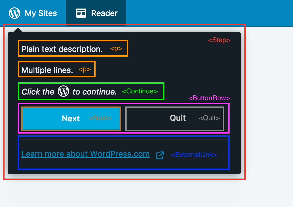
Here is the code used:
<Step name="example" placement="below" target="my-sites" arrow="top-left">
    { ( { translate } ) => (
        <Fragment>
            <p>Plain text description.</p>
            <p>Multiple lines.</p>
            <Continue step="next-step" click target="my-sites" icon="my-sites" />
            <ButtonRow>
                <Next step="next-step" />
                <Quit />
            </ButtonRow>
            <Link href="https://learn.wordpress.com">
                { translate( 'Learn more about WordPress.com' ) }
            </Link>
        </Fragment>
    ) }
</Step>;
ButtonRow
ButtonRow is a React component to display button controls in Step and takes care of their proper styling. Usually used as the last element of Step content to contain all available controls.
Example
<Step>
    { () => (
        <Fragment>
            <p>ButtonRow Example</p>
            <ButtonRow>
                <Next step="next-step" />
                <Quit />
            </ButtonRow>
        </Fragment>
    ) }
</Step>;
Continue
Continue is a React component that you can use in Step to programmatically continue the tour to other step based on user interaction with Calypso.
Props
step: (string) Name of the step the tour will advance to.target: (string, optional) DOM node that would be watched. See Targeting elements in Calypso for more info about the format.click: (bool, optional) If true,onClickwill be listened ontargetDOM node.hidden: (bool, optional) If true, this will not render anything in Step, while functionality remains.icon: (string, optional) Name of Gridicon to show in custom message.when: (function, optional) Redux selector. Once it evaluates to true, tour will advance tostep.children: (nodes, optional) If you provide children, the default content will be overridden.
Visual Options
There are three ways to define the content of this component.
- default text is "Click to continue." Use just as
<Continue … />with no children. - default text + Gridicon ("Click icon to continue.") - provide name of Gridicon as an
iconprop. Example:<Continue icon="my-sites" … /> - custom content - provide it as children:
<Continue …>My Content</Continue>
Functionality Options
There are currently two ways to declare the condition to continue the tour with Continue.
- Binding an
onClicklistener to the step's target DOM node and waiting for the node to be clicked in order to advance the tour. - Providing a Redux selector and waiting for it to evaluate to true in order to advance the tour.
// continue when user clicks DOM element with html attribute `data-tip-target="my-sites"`
<Continue step="next-step" click target="my-sites" />;
// continue when Redux selector evaluates to true (in this case after site credentials have been updated)
<Continue step="next-step" when={ siteHasCredentials } />;
Next
Link is a React component that shows a button that allows users to advance tour to another step. To be used inside of <ButtonRow>.
Props
step: (string) Name of the step the tour will advance to.
Label
Default label is "Next". To override, place your label as a child.
Example
// with default label
<Next step="next-step" />;
// or with a custom one
<Next step="next-step">{ translate( 'Custom Label' ) }</Next>;
Quit
Quit is a React component that shows a button that allows users to quit current tour. To be used inside of <ButtonRow>.
Props
primary(bool, optional) If true, button will be rendered as primary.
Label
Default label is "Quit". To override, place your label a child.
Example
// with a default label ("Quit")
<Quit />;
// with a custom label
<Quit>{ translate( 'Custom Label' ) }</Quit>;
// custom label + primary styling
<Quit primary>{ translate( 'Custom Label' ) }</Quit>;
Link
Link is a React component that shows a Link to external page in Step. It takes care of the styling and makes sure the link always opens in a new browser tab. We usually use it in the last step of tour where we nudge user to explore the docs to learn more about the area we just covered with a tour.
Place Link after ButtonRow (if present) for correct styling.
Example
// last step of tour with option to quit or visit learn.wordpress.com
<Step>
    { ( { translate } ) => (
        <Fragment>
            <p>This is the last step!</p>
            <ButtonRow>
                <Quit />
            </ButtonRow>
            <Link href="https://learn.wordpress.com">
                { translate( 'Learn more about WordPress.com' ) }
            </Link>
        </Fragment>
    ) }
</Step>;
makeTour
This is a higher-order component that makes sure your Tour gets all the required data in order to work and connect with the Guided Tours framework. Every Tour needs to be wrapped in this.
Example
In the file where the tour is defined, wrap the Tour declaration with makeTour and export the result.
export const MyTour = makeTour( <Tour name="my">…</Tour> );
combineTours
This is a factory for the top-level component of Guided Tours. You shouldn't be worrying about its internals, unless you are making framework changes. It accepts a single argument — an object with Tours — and is used in client/lib/guided-tours/config.js. When adding a new tour, make sure to include it in that file.
Example
combineTours( {
    main: MainTour,
    anotherTour: AnotherTour,
    thirdTour: ThirdTour,
} );
Targeting elements in Calypso
One of the features of Guided Tours is the ability to target DOM elements in Calypso. Targeting can be achieved in two ways:
data-tip-targetattribute on the target element (recommended)- using any CSS selector
To find the DOM node, document.querySelector is used. By default, the query used is [data-tip-target="${target}"]. However, if target contains a ., #, or a space character, we assume it's a CSS selector and it will be treated like a standard selector and be passed directly to the function, thereby allowing you to target elements that do no set a data-tip-target attribute. We run the query selector on every render so it possible to move elements around.
[data-tip-target]
Mark a target by adding data-tip-target="some-name" attribute to it with your value. Please be specific to avoid conflicts and use dash-case. In your tour, just insert the value of your desired [data-tip-target] into the target prop.
Using this method over CSS classes has several benefits, some of them are more explicit tagging of elements and decoupling the logic from CSS which should generally be used for styling. It is also less likely to be changed by somebody else as it has uncommon name and can be easily traced to Guided Tours Framework.
Example: you want to position a step of your tour to point to some input element.
<>
    { /* code somewhere in Calypso */ }
    <input type="text" name="example" value={ value } data-tip-target="my-example-input" />

    { /* in your tour */ }
    <Step name="example-step" target="my-example-input">
        …
    </Step>
</>;
CSS selector
There are cases when it might be a better idea to target an element by a CSS selector. You might use some classes to get elements in certain state or you might not be 100% in control of the markup (think controls of an external library).
We treat the target prop as a CSS selector if it contains ., #, or a space character.
Some examples
// select by class
<Step target=".sidebar-activity__likes" />;
// use a combo of classes to determine state - this selects the active item from masterbar
<Step target=".masterbar__item.is-active" />;
// detect state (has-thumbnail) and select a child (featured image)
<Step target=".reader-post-card.has-thumbnail .reader-post-card__featured-image" />;
// target id
<Step target="#header" />;
One special case
// target element
<Step target=" body" />;
Notice the space before "body" in the last example. This is a hack that forces the framework to use the value directly as a CSS selector and not as [data-tip-target="body"]. Please consider using any other way (CSS class, ID, custom attribute…) before settling with this one.