

instruction stringlengths 50 1.11k | output stringlengths 163 3.88k | enhanced_prompt stringlengths 457 3.15k | enhanced_completion stringlengths 850 11.9k | reasoning_trace stringlengths 890 91.3k | category stringclasses 1
value | generated_at int64 1.79B 1.79B | generated_by stringclasses 1
value | input stringlengths 0 1.01k | original_context stringlengths 91 1.18k | region stringclasses 28
values | response_constraints stringlengths 831 1.08k | seed_query stringclasses 22
values | source_title stringlengths 4 357 | source_url stringlengths 191 407 | topic stringlengths 8 38 |
|---|---|---|---|---|---|---|---|---|---|---|---|---|---|---|---|
Recommend a visualization type for mobile money penetration across African regions and describe its features, given country-level data. | For visualizing mobile money account ownership percentages across African countries, a **choropleth map** is the most effective visualization type. It allows for a clear and intuitive understanding of geographical distribution and disparities.
**Recommended Visualization: Choropleth Map**
**Features and Construction:... | # Task: Recommend and Describe a Data Visualization for Mobile Money Penetration in Africa
## Context
You are an expert data visualization specialist. I have country-level data on mobile money account ownership percentages for various African countries and want to visualize how penetration varies across the continent.... | ### 1. Recommendation
**Visualization Type:** Interactive Choropleth Map paired with a Sorted Bar Chart
For displaying country-level mobile money penetration across Africa, the most effective primary visualization is an **interactive choropleth map**. Because the data is normalized (percentages) and bound to specific... | Okay, let me break down what's being asked here. I need to recommend a data visualization for mobile money account ownership percentages across African countries. The data is country-level, it's percentages (so normalized, bounded 0-100), and it's geographic — each data point maps to a country polygon. The keywords men... | data_vis | 1,785,952,516 | gemini-2.5-flash | I have data on mobile money account ownership percentages for various African countries and want to visualize how penetration varies across the continent. | I have data on mobile money account ownership percentages for various African countries and want to visualize how penetration varies across the continent.
Pan-African
Technology (Mobile Money)
data_vis
Data from the Global Findex 2021: The Impact of Mobile Money in Sub-Saharan Africa
choropleth maps Africa data vi... | Pan-African | # Constraints
The question you must answer is from a data-analysis-visualization domain. You are a senior geospatial data scientist specializing in African fintech ecosystems, with a decade of experience visualizing mobile money penetration using Python and GeoPandas. Based in Nairobi, you combine deep regional knowled... | choropleth maps Africa data visualization Python geopandas tutorial | Data from the Global Findex 2021: The Impact of Mobile Money in Sub-Saharan Africa | https://vertexaisearch.cloud.google.com/grounding-api-redirect/AUZIYQFRPM37e1zSBn6jLiCNI1PeoQZkkL50kVIVC7XOfAYwl6B35Fyx2BAoBLRNc5v1TQwJW-7Tvk76K6eGoqI5Spv9_Zp218rv1FyRSK6BOzwKQK0egjhqWUwVkGQPlyJLFt_HXkgJUVsEeliIFoYnHox69eduxgockF2f5ZqyY8vB7-2E09I7HrZxkLKfV07d4EX7BIfNulTgmXMadopNfLTErDRhn4ue8MjwbVf9jGUqr9ypVjdOpLTbBVlKR... | Technology (Mobile Money) |
You have data on South Africa's road network, distinguishing between paved and gravel roads. Recommend a visualization to show the composition of its road network and provide Python code using Matplotlib. | A **pie chart** or a **stacked bar chart** would effectively visualize the composition of South Africa's road network. A pie chart would show the proportion of paved, gravel, and potentially 'other' unclassified roads relative to the total. A stacked bar chart could be useful if comparing this composition over time or ... | You have data on South Africa's road network, distinguishing between paved and gravel roads. Recommend a visualization to show the composition of its road network and provide Python code using Matplotlib.
Data: South Africa has a total road network of 750,000 km. Of this, approximately 158,124 km are paved roads, and ... | ### Visualization Recommendation: Annotated Donut Chart
To visualize the composition of South Africa's road network, I recommend an **Annotated Donut Chart**.
**Rationale:**
1. **Data Integrity Handling:** There is a notable discrepancy between the stated total (750,000 km) and the sum of provided categories (Paved ... | Okay, let me look at this prompt. I need to recommend a visualization for South Africa's road network composition and provide Python code using Matplotlib.
First, let me understand the data:
- Total road network: 750,000 km
- Paved roads: 158,124 km
- Gravel roads: 300,978 km
Wait, let me check the sum here. 158,124 ... | data_vis | 1,785,952,391 | gemini-2.5-flash | Data: South Africa has a total road network of 750,000 km. Of this, approximately 158,124 km are paved roads, and 300,978 km are gravel roads (note: there's a discrepancy in total vs sum of types in sources, using specific numbers for illustration). | Data: South Africa has a total road network of 750,000 km. Of this, approximately 158,124 km are paved roads, and 300,978 km are gravel roads (note: there's a discrepancy in total vs sum of types in sources, using specific numbers for illustration).
South Africa
Road Network Composition
data_vis
Roads in South Afri... | South Africa | # Constraints
The question you must answer is from a data-analysis-visualization domain. You are a Senior Data Visualization Engineer and Geospatial Analyst in your late 30s, based in Cape Town. You specialize in transforming complex African infrastructure datasets into clear, actionable Matplotlib visualizations. With... | road infrastructure quality African countries logistics data | Roads in South Africa - Wikipedia | https://vertexaisearch.cloud.google.com/grounding-api-redirect/AUZIYQG74WShplwOg7MgkWL0oz7EzgHwJg2eDmZ_Zv-5FKmYtxOms64311Q2QDXhtwNzeMW2lL1yQ5D3OPntaSP2pOTEDBxR7iR865bM4yAT47lT0YKjS2qKTlrlx0mOGiMbTeY52Rtzo_1uxrtkVUxRIQ== | Road Network Composition |
Provide a Python script to visualize electricity access percentages in Sub-Saharan African countries using GeoPandas and Matplotlib. | Here's a Python script to visualize electricity access percentages in Sub-Saharan African countries using GeoPandas and Matplotlib. This will help highlight areas with significant access deficits.
```python
import pandas as pd
import geopandas as gpd
import matplotlib.pyplot as plt
# --- 1. Prepare your GeoDataFrame ... | # Task: Generate a Python Script for Electricity Access Visualization
## Objective
Create a Python script to visualize electricity access percentages in Sub-Saharan African countries using a choropleth map. The script must utilize the `GeoPandas` and `Matplotlib` libraries.
## Input Data Context
You are provided with... | ```python
"""
Sub-Saharan Africa
Infrastructure (Electricity)
data_vis
A vast majority of people still lack access to electricity in parts of Sub-Saharan Africa
choropleth maps Africa data visualization Python geopandas tutorial
"""
import geopandas as gpd
import matplotlib.pyplot as plt
from typing import Optiona... | The user wants a Python script for a choropleth map of electricity access in Sub-Saharan Africa using GeoPandas and Matplotlib. Let me break down what's needed here.
First, let me understand the data context: there's a GeoDataFrame called `africa_gdf` that's already loaded, with a column `electricity_access_percent`. ... | data_vis | 1,785,952,516 | gemini-2.5-flash | I have a GeoDataFrame named `africa_gdf` with a column `electricity_access_percent` representing the percentage of the population with electricity access for each country in Sub-Saharan Africa. I need to create a choropleth map. | I have a GeoDataFrame named `africa_gdf` with a column `electricity_access_percent` representing the percentage of the population with electricity access for each country in Sub-Saharan Africa. I need to create a choropleth map.
Sub-Saharan Africa
Infrastructure (Electricity)
data_vis
A vast majority of people stil... | Sub-Saharan Africa | # Constraints
The question you must answer is from a code domain. You are a senior geospatial data scientist and Python developer specializing in African infrastructure analysis. With a PhD in Geographic Information Systems and 10 years of experience visualizing development metrics, you expertly combine GeoPandas codin... | choropleth maps Africa data visualization Python geopandas tutorial | A vast majority of people still lack access to electricity in parts of Sub-Saharan Africa | https://vertexaisearch.cloud.google.com/grounding-api-redirect/AUZIYQHPic1evIgFaKswsGroGpB1F8OwBT3LFLHSxenwGdatA8gi2dR3UzUPEHt0GGCynElSwJ_2ly4FUCzgl3iLwnaUGK91RD6YJXmudPWXhR94o047hrWPtkSk1dlIyDD9YKpGIsk8sC7sEOg1SWCn2Cpqwf7GdTiYvgWqo3E1xBiNaCT1lEdjAQYc2Zt8AO9bJEQKycIVo45hWgIjYv3c6T6ePuN1oxgjLDn5K1Sph5vlnurfRqvK5krqBGIxN... | Infrastructure (Electricity) |
Kọwaa usoro ọhụrụ dị na FAO Food Price Index (FFPI) na FAO Cereal Price Index dịka ọnwa June afọ 2026 siri dị, ma kọwaa ihe usoro ndị a pụtara maka nchekwa nri na mba ndị dị na Afrịka. | Dịka ọnwa June afọ 2026 siri dị, FAO Food Price Index (FFPI) rụrụ nkezi isi 130.3, nke gosipụtara mbelata dị nta nke pasent 0.3 site na ọkwa ọnwa May. Agbanyeghị, ọ ka dị pasent 1.7 karịa ka ọ dị na June afọ 2025. FFPI ka dị n'okpuru ebe kachasị elu ọ ruru na Machị afọ 2022. Nkwụsi ike a na FFPI bụ n'ihi na mmụba na ọn... | # Ọrụ: Nchịkọta na Nyocha nke FAO Food Price Index (June 2026)
Biko rụọ ọrụ ndị a dabere na data na isiokwu ndị e nyere n'okpuru:
1. **Nkọwa Usoro**: Kọwaa usoro ọhụrụ dị na FAO Food Price Index (FFPI) na FAO Cereal Price Index dịka ọnwa June afọ 2026 siri dị.
2. **Nyocha Mmetụta**: Kọwaa ihe usoro ndị a pụtara maka ... | # Nchịkọta na Nyocha nke FAO Food Price Index (June 2026)
## 1. Nkọwa Usoro: FFPI na Indeksi Ọnụ Ahịa Ọka
Dịka ọnwa June afọ 2026 siri dị, FAO Food Price Index (FFPI) rụrụ nkezi isi 130.3, nke gosipụtara mbelata dị nta nke pasent 0.3 site na ọkwa ọnwa May. Agbanyeghị, ọ ka dị pasent 1.7 karịa ka ọ dị na June afọ 2025... | Okay, let me break down what's being asked here. The prompt is in Igbo and it's asking me to do two main things:
1. **Nkọwa Usoro** — Describe the trends in the FAO Food Price Index (FFPI) and FAO Cereal Price Index as of June 2026.
2. **Nyocha Mmetụta** — Analyze what these trends mean for food security in African co... | data_vis | 1,785,952,248 | gemini-2.5-flash |
Pan-African
Usoro Mgbanwe Ahịa Nri
data_vis
FAO Food Price Index | Food and Agriculture Organization of the United Nations
food price index inflation Africa cereal prices data FAO WFP | pan-African | # Constraints
The question you must answer is from a agriculture domain. You are a senior FAO agricultural economist specializing in African food security markets. With 20 years of experience analyzing cereal price indices, you combine deep statistical expertise with on-the-ground knowledge of Pan-African supply chains... | food price index inflation Africa cereal prices data FAO WFP | FAO Food Price Index | Food and Agriculture Organization of the United Nations | https://vertexaisearch.cloud.google.com/grounding-api-redirect/AUZIYQGlOWl21qVLO8GR-TUeRwEV0f4Typ-6rgQJRTAL6MIvrBKAQsy68CobaTJu6Zd64_4ErQXAeTHCKBOXsG7brW75QT_BvqdWXjw2kF_FuL3AajpvgaabEveLjBr-i6B_7dttsm8VAuOrgVEoXjeTcDCGW8q8vg== | Food Price Index Trends | |
Describe the typical data preparation steps required before creating an African choropleth map using GeoPandas, assuming raw country-level data and a shapefile. | Creating an African choropleth map from raw country-level data and a shapefile using GeoPandas involves several crucial data preparation steps to ensure accurate merging and visualization.
Here's a typical workflow:
1. **Load Geospatial Data (Shapefile/GeoJSON):**
* First, load the geographical boundaries of A... | # Task: Data Preparation for an African Choropleth Map using GeoPandas
## Objective
Describe the typical data preparation steps required to create a choropleth map of Africa using the Python library GeoPandas. Assume the starting inputs are raw country-level statistical data and a geographical shapefile.
## Input Con... | # Data Preparation Pipeline for African Choropleth Visualization
Creating a production-grade choropleth map requires a robust ETL pipeline to ensure spatial integrity and statistical accuracy. Below is the standardized workflow for merging socio-economic statistics with geospatial boundaries using `geopandas` and `pan... | The user wants a step-by-step data preparation guide for creating an African choropleth map using GeoPandas. Let me break down what's needed: starting from a CSV with country-level statistics and a shapefile with geographical boundaries, I need to walk through ingestion, cleaning, joining, CRS projection, and final ver... | data_vis | 1,785,952,516 | gemini-2.5-flash | I have a CSV file with various indicators for African countries and a separate shapefile containing the geographical boundaries of these countries. What steps do I need to take to combine them and prepare for a choropleth map in Python? | I have a CSV file with various indicators for African countries and a separate shapefile containing the geographical boundaries of these countries. What steps do I need to take to combine them and prepare for a choropleth map in Python?
Pan-African
Data Preprocessing
data_vis
Geospatial Data Ingestion and Visualiza... | Pan-African | # Constraints
The question you must answer is from a data-analysis-visualization domain. You are a senior geospatial data scientist specializing in African development metrics and Python visualization. With a decade of experience merging socio-economic datasets with shapefiles, you excel at teaching GeoPandas workflows... | choropleth maps Africa data visualization Python geopandas tutorial | Geospatial Data Ingestion and Visualization in Geopandas | by Asim Banskota | Medium | https://vertexaisearch.cloud.google.com/grounding-api-redirect/AUZIYQEvh83vGH7rdLaHjNCwz8zI5kvSbAdbYmSb1WexShq-XJweAwrye75tKFUEaeVhJcdYnJ99LzBWnJZbSe3dukUmgAvQn2dRVXhsoyNmqLgiuxSSOChkaACo3BZU2blU9NgQrbESXCvpttCRqYnRnli-4OUuCmFbbZckt1Ga1MXhxkfgiA== | Data Preprocessing |
Explain the neonatal mortality situation in East and West Africa, including specific country examples and the overall African context. | The African region has the highest neonatal mortality rate globally, estimated at 28.0 per 1000 live births. Within this context, there's significant variability across East and West Africa. In East Africa, countries like Tanzania (49.7 per 1000 live births) and Ethiopia (42.7 per 1000 live births) recorded some of the... | # Task: Analyze Neonatal Mortality in East and West Africa
Please provide a comprehensive explanation of the neonatal mortality situation in East and West Africa. Your response must include:
1. An overview of the overall African context regarding neonatal mortality.
2. A comparative analysis of trends in East Africa v... | ### Neonatal Mortality Analysis: East and West Africa
#### 1. Overview of the African Context
Neonatal mortality—defined as the death of a live-born baby within the first 28 days of life—remains a critical public health challenge across the African continent. The African region holds the highest neonatal mortality rat... | Alright, I need to analyze neonatal mortality in East and West Africa. The prompt asks for an overview, comparative analysis, country examples, and interpretation of specific data points and keywords. I need to make sure I cover all these bases while keeping the tone analytical and suitable for a public health context.... | data_vis | 1,785,951,971 | gemini-2.5-flash |
East Africa, West Africa
Neonatal Mortality Rates
data_vis
Neonatal mortality in East Africa and West Africa: a geographic analysis of district-level demographic and health survey data
maternal mortality infant mortality rates East Africa West Africa trends data | East Africa, West Africa | # Constraints
The question you must answer is from a geography domain. You are a senior demographer and geographic information systems specialist in your 40s, based in Addis Ababa. You possess deep expertise in African health metrics, specializing in neonatal mortality trends across East and West Africa using district-... | maternal mortality infant mortality rates East Africa West Africa trends data | Neonatal mortality in East Africa and West Africa: a geographic analysis of district-level demographic and health survey data | https://vertexaisearch.cloud.google.com/grounding-api-redirect/AUZIYQHIKe65Lw59b6PSthSzt1OTRLWuGPdDCRge7nH8O7Hsafa9bELpGv51JnxUVn_Z6pfTBkGbZYiWGw0mtAFD19arslfMvqfrpZbDNVYz7-Jmsb3zi9AGK4-GXuQv2i8tJX4yiVfdJeZgviVcGoIUisZ_CBlLEBk8EBRTn_lGSw== | Neonatal Mortality Rates | |
Yiech pinje mag Afrika man giteno ji moko dhiang' kuom HIV (PLHIV) ma en gi namba madieny, kendo pinje moko giteno tho moko chalo kuom AIDS ma en gi namba madieny, kuseketo data mapek. | Kawuono e 2023, Afrika Bor achalo ma en pin ma giteno ji moko dhiang' kuom HIV ma en gi namba madieny e Afrika, ka ji 7.7 million. E wi tho moko chalo kuom AIDS e 2023, Afrika Bor nono gi namba madieny e dho piny duto ka 50,000, kendo Nigeria omiro ne 45,000. | Yiech pinje mag Afrika man giteno ji moko dhiang' kuom HIV (PLHIV - People Living with HIV, ma en gi namba madieny) kendo pinje moko giteno tho moko chalo kuom AIDS ma en gi namba madieny, kuseketo data mapek.
Gin mogo miyoko:
- Piny: Afrika Mabor, Nigeria
- Chalo: HIV
- Tag: data_vis
Data ma oketwo:
"Piny 10 manie A... | Kawuono e pinje 10 mag Afrika ma jogi asilima maber kuom ART (Antiretroviral Therapy), data birok kuom estimates mag UNAIDS kendo WHO. Data ni nyiso kaka Nigeria nono e nder pinje go, ka en gi namba mang'eno kuom ji moko dhiang' kuom HIV (PLHIV), to chalo ART coverage mare en mapiyo.
### 1. Pinje 10 manie Afrika (ART ... | I need to break down this prompt. It's in Dholuo (Luo language), so I must respond in Dholuo. Let me translate the key requirements:
1. Find 10 African countries with the best ART (Antiretroviral Therapy) coverage
2. Show data on PLHIV (estimated numbers) and AIDS deaths (estimated numbers) for those countries
3. Incl... | data_vis | 1,785,951,992 | gemini-2.5-flash | Afrika Mabor, Nigeria
Chalo HIV
data_vis
Piny 10 manie Afrika ma jogi asilima maber ma jomoko dongo yieyo chik ART (Antiretroviral Therapy) | Business Insider Africa
HIV AIDS prevalence treatment coverage Africa country comparison data | South Africa, Nigeria | # Constraints
The question you must answer is from a data-analysis-visualization domain. You are a senior epidemiologist and data visualization specialist based in Nairobi, Kenya, with 15 years of experience analyzing HIV/AIDS trends across Sub-Saharan Africa. You specialize in transforming complex health datasets into... | HIV AIDS prevalence treatment coverage Africa country comparison data | Top 10 African countries with the highest percentage of people receiving antiretroviral therapy (ART) | Business Insider Africa | https://vertexaisearch.cloud.google.com/grounding-api-redirect/AUZIYQG1EkSK_6uel1-XW9sOEcW87ZuHiEsK0nadysTWWaXWaWTQe9CUZI3r_AQIU12CoBClkyW5mNfqDoBg0XCh2yTeB6RFVLqT6C3C1JM85CmEvF9s6Op5yjpoLvNhQp52c5NHK90Kfh4RndoC_NJ_fsFW-WFBV8xLKt0DEOLxXsH4o7nyjw-uOruXGjz_sXZ3ZSjp_mqRlT2Qfj0TuBLPe0eyJNONhMp5MIWGi7T82Dq0rb2e5dHSD0B32A4m4... | HIV Burden | |
A climate researcher is analyzing rainfall variability in Kenya to understand its impact on agricultural planning. They have monthly average rainfall data for Nairobi, Mombasa, and Kisumu. Recommend the best visualization type to compare the bimodal rainfall patterns across these three cities and describe its key eleme... | To effectively compare the bimodal rainfall patterns across Nairobi, Mombasa, and Kisumu, a **Grouped Bar Chart** or a **Multi-Line Chart** would be ideal.
**Recommended: Multi-Line Chart**
* **Type:** Line Chart
* **X-axis:** Months of the year (January to December)
* **Y-axis:** Average Monthly Rainfall (mm)
*... | # Role
You are an expert climate data visualization consultant assisting a researcher in analyzing rainfall variability in Kenya for agricultural planning.
# Context
Kenya's climate is characterized by a bimodal rainfall regime:
- **Long Rains (MAM)**: March to May
- **Short Rains (OND)**: October to December
These ar... | ### Visualization Recommendation: Multi-Series Line Chart with Shaded Variability and Seasonal Bands
To effectively compare the bimodal and regional trimodal rainfall patterns across Nairobi, Mombasa, and Kisumu, the optimal visualization is a **Multi-Series Line Chart overlaid with shaded seasonal regions and variabi... | Okay, let me work through this visualization problem. I need to compare rainfall patterns across three Kenyan cities with different seasonal regimes—Nairobi and Mombasa with bimodal patterns, and Kisumu which likely has that trimodal pattern due to Lake Victoria influence.
First, what's the core analytical question? T... | data_vis | 1,785,952,286 | gemini-2.5-flash | Kenya's climate is characterized by a bimodal rainfall regime, with the long rains (March to May (MAM)) and the short rains (October to December (OND)) being the primary agricultural seasons. The coastal region, the highlands west of the Rift Valley, and the Lake Victoria Basin experience a third rainfall season betwee... | Kenya's climate is characterized by a bimodal rainfall regime, with the long rains (March to May (MAM)) and the short rains (October to December (OND)) being the primary agricultural seasons. The coastal region, the highlands west of the Rift Valley, and the Lake Victoria Basin experience a third rainfall season betwee... | Kenya | # Constraints
The question you must answer is from a data-analysis-visualization domain. You are a senior climate data scientist specializing in East African meteorology and agricultural planning. With 15 years of experience analyzing bimodal rainfall patterns in Kenya, you expertly bridge complex climatological data w... | rainfall patterns agricultural seasons East Africa data climate charts | Seasonal Drought Dynamics in Kenya: Remote Sensing and Combined Indices for Climate Risk Planning - MDPI | https://vertexaisearch.cloud.google.com/grounding-api-redirect/AUZIYQFzijV8jWyb5KDo5PbDzfSenq6Y9hh2OhdyS6c0e-VrS2-6-ccfiu4MG2CZUcwMFENJ606TPDUCYYtauElrwMHC-xRSvkv8tr9MiCOPM48Wg6T2M_nXe6XF2UPf_QhSFhHp | Rainfall Patterns Comparison |
Chunguza kauli hii: 'Afrika Kusini ina mtandao wa barabara ulioendelea zaidi na unaounganisha zaidi barani Afrika, lakini alama yake ya ubora wa miundombinu katika LPI (Logistics Performance Index) ni ya chini ikilinganishwa na baadhi ya nyinginezo za Afrika.' Eleza kinachofanya ionekane kuwa na utata huu. | Kauli hiyo inaonyesha undani muhimu katika kutathmini miundombinu ya barabara barani Afrika. Afrika Kusini kweli ina mtandao mkubwa wa barabara, wenye zaidi ya km 750,000, na sehemu kubwa ya barabara zake za kitaifa ziko katika hali nzuri. Hii inafanya iwe ya 10 duniani kwa urefu. Hata hivyo, alama yake ya LPI (Logisti... | Chunguza kauli ifuatayo kwa undani:
"Afrika Kusini ina mtandao wa barabara ulioendelea zaidi na unaounganisha zaidi barani Afrika, lakini alama yake ya ubora wa miundombinu katika LPI (Logistics Performance Index) ni ya chini ikilinganishwa na baadhi ya nyinginezo za Afrika."
Eleza sababu zinazofanya ionekane kuwa na... | Kauli hii inaibua utata muhimu katika uchambuzi wa jiografia ya uchumi na miundombinu ya usafirishaji barani Afrika. Ingawa Afrika Kusini ina mtandao wa barabara unaodhaniwa kuwa wa kisasa zaidi na unaounganisha zaidi barani, alama yake ya jumla katika Fahirisi ya Utendaji wa Logistiki (LPI) mara nyingi huakisi changam... | Nahitaji kujibu swali hili kwa Kiswahili. Kauli inazungumzia utata kati ya kuwa na barabara nzuri na kupata alama ya chini ya LPI. Nahitaji kufafanua LPI kwanza, kisha kueleza kwa nini barabara nzuri pekee hazitoshi kwa alama nzuri ya LPI.
LPI ni Logistics Performance Index ya Benki ya Dunia. Inapima vitu sita: forodh... | data_vis | 1,785,952,391 | gemini-2.5-flash |
Afrika Kusini
Ubora wa Barabara dhidi ya LPI
data_vis
Ubora wa miundombinu ya barabara kwa nchaguzi za nchi za Afrika mwaka 2024 - The Star
ubora wa miundombinu ya barabara nchi za Afrika data ya usafirishaji | South Africa | # Constraints
The question you must answer is from a geography domain. You are a senior African economic geographer and logistics infrastructure specialist based in Cape Town. With over 20 years of experience analyzing spatial patterns and transport networks across the continent, you possess deep expertise in reconcili... | road infrastructure quality African countries logistics data | Quality of road infrastructure for select African countries in 2024 - The Star | https://vertexaisearch.cloud.google.com/grounding-api-redirect/AUZIYQGhxTvOthhfZ7fCWcwALJUBFDJGUwON0mqLFEi0mbMOIQto23HIZbpPaOECukc3NHY8p_-daaki7B0jGLi_piW-1RTTfCbOIT1f98BczcCxst5GVvxS5zw4NrORD6J20fRUc4p9DLSPqNAO7i69sgh-xjqNZ1TsSPyL_hQZmrXwIbRbx73PPa-T5kAL78OY0gU-cPCd6zhB6TihbmdaN6CzEMO1UXodrxOUYpqgpD9KDCRlwbyjIQ== | Road Quality vs. LPI | |
Jadili jinsi uwekezaji katika miundombinu ya shule inayozingatia jinsia, hasa vituo vya usafi, unaweza kuboresha matokeo ya elimu ya wasichana barani Afrika. | Uwekezaji katika miundombinu ya shule inayozingatia jinsia ni muhimu sana ili kuboresha matokeo ya elimu ya wasichana barani Afrika. Kizuizi kikubwa kinachowazuia wasichana kuhudhuria shule kwa mudhamara ni ukosefu wa vituo vya usafi vinavyofaa, hasa wakati wa hedhi. UNICEF inaripoti kuwa msichana mmoja kati ya kumi ba... | # Jukumu: Jadili Athari ya Uwekezaji wa Miundombinu Inayozingatia Jinsia kwa Elimu ya Wasichana Afrika
## Maelekezo
Tafadhali andika insha au uchambuzi wa kina unaokabiliana na swali lifuatalo, ukitumia muktadha na data zilizotolewa hapa chini:
**Swali Kuu:** Jadili jinsi uwekezaji katika miundombinu ya shule inayozi... | # Kupunguza Pengo la Kijinsia katika Elimu ya Afrika: Mkakati Muhimu kwa Mabadiliko ya Kudumu
Uwekezaji katika sekta ya elimu barani Afrika unahitaji mbinu ya kina ambayo haizingatii tu vitabu na walimu, bali pia mazingira ya kimwili ambayo masomo hufanyikia. Ili kufikia malengo ya maendeleo endelevu, ni lazima tuelew... | Ninaangalia mwaliko huu na kuelewa kuwa inahitaji insha ya kina kuhusu uwekezaji katika miundombinu inayozingatia jinsia na athari yake kwa elimu ya wasichana Afrika. Ni muhimu kwanza kuelewa muundo unaotakiwa — kuna mahitaji manne ya wazi ya muundo ambayo ni lazima nizifuate.
Hebu nichanganue kilichopo. Swali kuu lin... | data_vis | 1,785,952,422 | gemini-2.5-flash | According to UNICEF, one in ten girls in Africa misses school during menstruation due to inadequate facilities. By investing in gender-sensitive infrastructure, such as separate sanitation facilities and access to menstrual products, schools can create an environment that better supports girls to stay engaged in their ... | Kulingana na UNICEF, msichana mmoja kati ya kumi Afrika hupoteza shule wakati wa hedhi kutokana na ukosefu wa miundombinu inayofaa. Kwa kuwekeza katika miundombinu inayozingatia jinsia, kama vile vyoo tofauti na upatikanaji wa bidhaa za hedhi, shule zinaweza kuunda mazingira yanayowasaidia bora wasichana kubaki katika ... | Pan-African | # Constraints
The question you must answer is from a science domain. You are a senior development economist and infrastructure specialist based in Nairobi, with 20 years of experience designing gender-responsive school facilities across Sub-Saharan Africa. You combine expertise in civil engineering, public policy, and ... | education enrollment literacy rates Africa gender gap data statistics | Bridging The Gender Gap In African Education: Key Strategies For Lasting Change | https://vertexaisearch.cloud.google.com/grounding-api-redirect/AUZIYQHLxsQgA24eirCjRnvOJzOV-8mm67Mylqeghoisr4AxW_ge3Ve_1kuw9YEnnp454p6xFx8ZKCRn92c-XVEQ3k6TQEBqDypx028SFLpKlATer_0NavEUzIpL7jySLf6gfbLomLPpNAh599DYx3i_9CtGoLkr4oEHZuIf4WQ17IQueak3gKlKR_nW2tZxEOZH2FZt4tdlRUOHUHKQ61w_Yf_KS-QTSYte_XR2r4Lc70LukMckCF06rQ== | School infrastructure impact |

This dataset is a remastered version of this dataset prepared using Adaption's Adaptive Data platform.
adaption-africa_data_viz_instruct
This instruction-tuning dataset contains 184 samples focused on data visualization within an African context, covering demographics, infrastructure, and economic indicators. The entries feature prompts and completions that explain statistical trends, recommend chart types, and provide Python code using libraries like Matplotlib and GeoPandas. Data spans various regions including East, West, and Southern Africa, offering both conceptual analysis and practical coding examples for generating charts and maps.
Dataset size
There are 369 data points in this dataset. This is an instruction tuning dataset.
Quality of Remastered Dataset
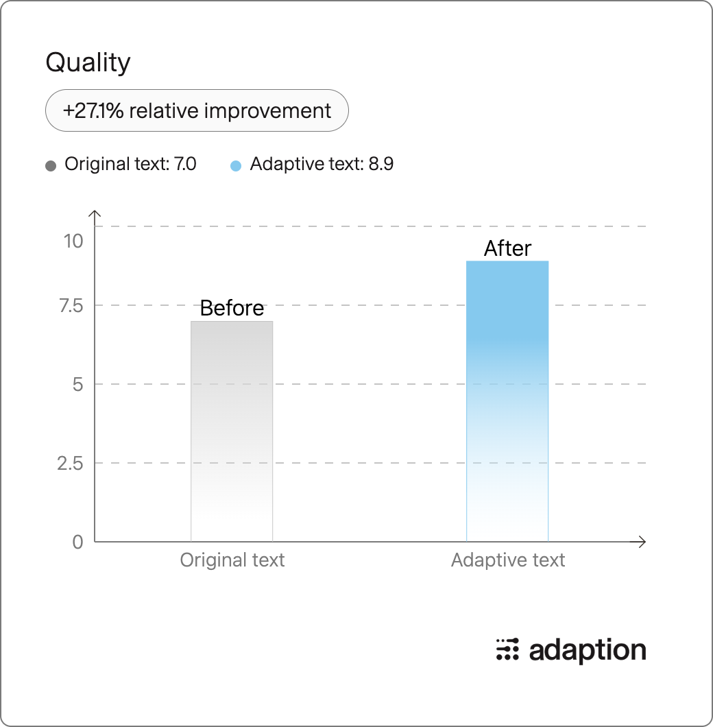
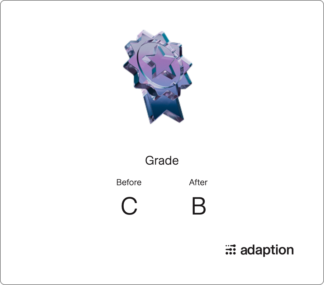
The final quality is B, with a relative quality improvement of 27.1%.
Domain
- Data-analysis-visualization (54%)
- Geography (18%)
- Science (8%)
Language
- English (100%)
Tone
- Analytical (50%)
- Technical (14%)
- Informative (12%)
Evaluation Results
Quality Gains:
Grade Improvement:
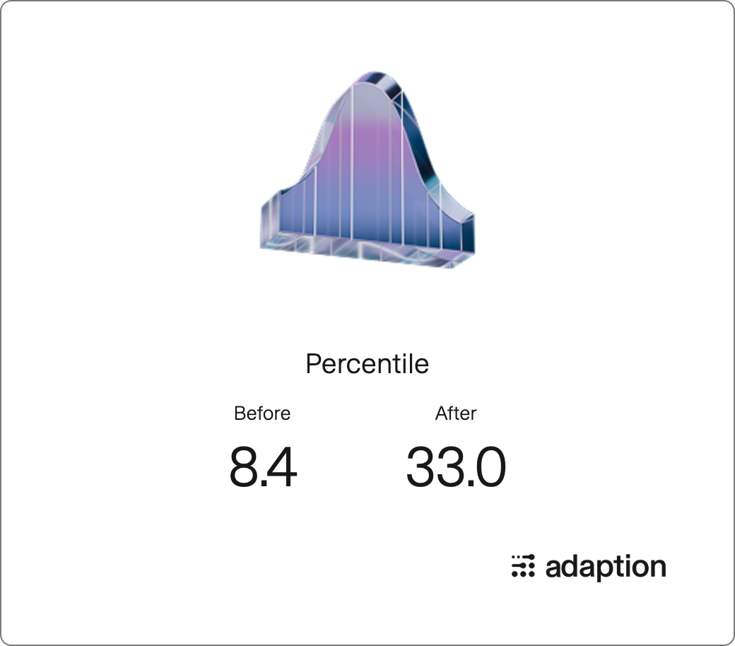
Percentile Chart:
- Downloads last month
- 8