
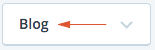
Select Dropdown
React component used to display a dropdown selector.
It can be utilized via two different techniques: children components or an options array. These techniques are available because certain use cases prefer the "selection" logic to be built into SelectDropdown, while others prefer to explicitly define that logic elsewhere.
Using Children
The children technique is appropriate when you'd like to define the "selection" logic at the same point where <SelectDropdown> is implemented.
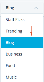
A good example for this case is navigation. Sometimes the option that is selected is defined by the route, other times it's a state value, external prop, etc.
import SelectDropdown from 'calypso/components/select-dropdown';
export default function MyComponent() {
return (
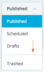
<SelectDropdown selectedText="Published">
<SelectDropdown.Item selected path="/published">
Published
</SelectDropdown.Item>
<SelectDropdown.Item path="/scheduled">Scheduled</SelectDropdown.Item>
<SelectDropdown.Item path="/drafts">Drafts</SelectDropdown.Item>
<SelectDropdown.Item path="/trashed">Trashed</SelectDropdown.Item>
</SelectDropdown>
);
}
The key here is that it's up to the parent component to explicitly define things like: which item is selected, what the selected text is (used in the dropdown header), and potentially onClick callbacks, etc.
Props
Select Dropdown
selectedText
Used for displaying the text on the dropdown header.
selectedCount
Used for displaying the count on the dropdown header.
selectedIcon
Used for displaying an icon on the dropdown header.
className
Optional extra class(es) to be applied to the .select-dropdown.
tabIndex
Optional tabIndex setting to override tab order via keyboard navigation. By default this is set to 0 which simply puts the element in the tabbing flow according to the component's placement in the document.
disabled
Used to determine whether the select dropdown is in a disabled state. When disabled it will not respond to interaction and will render to appear disabled.
ariaLabel
Optional dropdown header label that can be used to improve the accessibility for screen readers.
Dropdown Item
selected
Boolean representing the selected visual state. selected={ true } creates a blue background on the selected item.
count
Optional number to show a Count next to the item text.
icon
Optional icon to show before the item text.
path
Optional URL to navigate to when option is clicked.
disabled
Optional bool to disable dropdown item.
onClick
Optional callback that will be applied when a SelectDropdown.Item has been clicked. This could be used for updating a parent's state, tracking analytics, etc.
ariaLabel
Optional dropdown item label that can be used to improve the accessibility for screen readers.
Label
An item "label" can be added like as a sibling to SelectDropdown.Item. The purpose
of this SelectDropdown.Label component is used to display a static item, for example, to group
items.
Separator
As a sibling to SelectDropdown.Item, an item "separator" or horizontal line can be used to visually separate items.
import SelectDropdown from 'calypso/components/select-dropdown';

export default class extends React.Component {
    // ...

    render() {
        return (
            <SelectDropdown selectedText="Published">
                <SelectDropdown.Label>
                    <em>Post status</em>
                </SelectDropdown.Label>
                <SelectDropdown.Item selected path="/published">
                    Published
                </SelectDropdown.Item>
                <SelectDropdown.Item path="/scheduled">Scheduled</SelectDropdown.Item>
                <SelectDropdown.Item path="/drafts">Drafts</SelectDropdown.Item>
                <SelectDropdown.Separator />
                <SelectDropdown.Item path="/trashed">Trashed</SelectDropdown.Item>
            </SelectDropdown>
        );
    }
}
Using options array
SelectDropdown can also be used by passing in an options array as a prop. This technique is great for situations where you don't want to explicitly define things like what happens when an item is clicked or which item is currently selected, etc.
A good example for this case is a form element. You don't want to have to write the logic for updating the component when a new selection is made, but you might want to hook into certain events like: when a new selection is made, what was the option?
NOTE - there is still more work here in order to be fully functional as a form element, not recommended use case... yet.
import SelectDropdown from 'calypso/components/select-dropdown';

const options = [
    { label: 'Post status', isLabel: true },
    { value: 'published', label: 'Published' },
    { value: 'scheduled', label: 'Scheduled' },
    { value: 'drafts', label: 'Drafts' },
    { value: 'trashed', label: 'Trashed' },
];

export default class extends React.Component {
    // ...

    handleOnSelect = ( option ) => {
        console.log( 'selected option:', option ); // full object of selected option
    };

    render() {
        return <SelectDropdown options={ options } onSelect={ this.handleOnSelect } />;
    }
}
Note that all the "selection" logic will be applied in SelectDropdown itself using a simple selected value comparison in state. It will update itself when an option has been clicked.
Props
options
The main data set for rendering out the various options.
const options = [
    {
        value: 'the value', // *required* - (string) tracked by component
        label: 'the label', // *required* - (string) displayed to user
        isLabel: true, // optional - (boolean) set this item like a static label
        path: '/', // optional - (string) URL to navigate when clicked
    },
    // ...
];
initialSelected
Optional string representing the initial selected option's value. Default will be the first option's value.
compact
Optional boolean indicating the dropdown will be rendered in compact mode
onSelect
Optional callback that will be run whenever a new selection has been clicked.
onToggle
Optional callback that will be run after the dropdown is opened or closed. An event object is passed, including a target property equal to the SelectDropdown React element instance, and open equal to the current toggle state of the dropdown.
Label
Adding isLabel key set to true into the item object will create a SelectDropdown.Label component.
const options = [
    { label: 'Post status', isLabel: true },
    { value: 'published', label: 'Published' },
    { value: 'scheduled', label: 'Scheduled' },
    { value: 'drafts', label: 'Drafts' },
    null,
    { value: 'trashed', label: 'Trashed' },
];
Separator
Using a null or false item in the options will render an item "separator" or horizontal line can be used to visually separate items.
const options = [
    { value: 'published', label: 'Published' },
    { value: 'scheduled', label: 'Scheduled' },
    { value: 'drafts', label: 'Drafts' },
    null,
    { value: 'trashed', label: 'Trashed' },
];